Some typefaces dominate their era and then retire to history books. Garamond did the opposite: it helped invent the modern book, went quiet for two centuries, and then came back to become perhaps the most beloved text face in the world. Printed novels, wedding invitations, museum catalogs, legal briefs, the early Apple brand — centuries of the written word have worn its face. And beneath all that familiarity lies one of the strangest stories in typography, involving a case of mistaken identity that stood uncorrected for over two hundred years. This review covers the real history, the design’s enduring virtues, its honest limitations, and which of the many modern “Garamonds” you should actually use.
Origins: The Punchcutter of Paris
Claude Garamont (c. 1510–1561) — the name is often spelled Garamond, and both are acceptable — was a punchcutter: the craftsman who cut steel punches, character by character, from which type was cast. He worked in Paris, then the printing capital of Europe, and his talent was recognized early: by his twenties he was cutting type for the great publisher Robert Estienne, and his Greek typefaces were commissioned by the French crown.
Garamont’s roman letterforms refined a tradition inherited from Venetian pioneers like Aldus Manutius and Nicolas Jenson. What set his work apart was proportion and restraint — letters that were calm, even and quietly beautiful rather than ornate. After his death, his punches and matrices passed through the hands of other type founders, and through the great Antwerp printer Christophe Plantin his designs survived, physically, into modern museum collections.
Here is the twist that typographic detectives unraveled only in the twentieth century: most of what the world called “Garamond” from the late 1700s onward was not Garamont’s work at all. In 1827, the French national printing office attributed a stock of old type to Garamont; based on that attribution, founders across Europe cast revivals, and the name became generic. But scholarship — notably by typographic historians in the 1920s — showed that the celebrated models were actually cut by Jean Jannon, a Protestant printer working in Sedan some sixty years after Garamont’s death, in a similar but visibly distinct style. Garamont’s true letters, preserved in Plantin’s collection, were slimmer and more delicate.
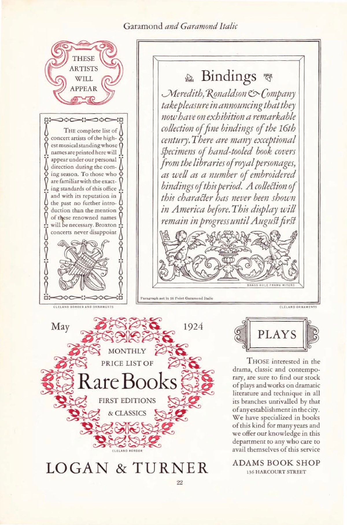
By then, “Garamond” the name had become bigger than any single man’s punches: it denoted a whole genre of old-style French serif. The twentieth-century revivals — ATF Garamond (1917), Monotype Garamond (1922), Stempel Garamond (1925), and much later Adobe Garamond (1989) and Sabon (1964) — each chose a different balance between Jannon’s design and Garamont’s authentic ones. Knowing which tradition your “Garamond” belongs to is essential, because they differ meaningfully in color, weight and size.
The Design: The Old-Style Ideal
What makes an old-style serif
Garamond is the textbook specimen of the old-style class, and every one of its traits is functional Renaissance logic rather than decoration:
- Slanted stress. The thick and thin parts of each letter follow the angle of a broad-nib pen held in the hand, not the vertical axis of later “modern” faces.
- Modest contrast. Thick and thin strokes differ, but gently — no hairlines to break up on rough paper.
- Bracketed serifs. The serifs flow into the stem with a curved shoulder, softening the junction.
- A small x-height relative to cap height. Garamond’s lowercase is famously compact under its capitals, with long, elegant ascenders and descenders. This gives pages their airy, humanistic texture — and, like Futura, dictates how the face must be sized.
- Old-style numerals. The default figures are “text figures,” with heights and descenders like lowercase letters (3 and 5 descending, 6 and 8 ascending), blending beautifully into running text.
The paragraph is the unit of design
The deepest compliment paid to Garamond is that it is designed at the paragraph level. Every individual letter is pleasant; more importantly, thousands of them together produce an even, restful “color” on the page that lets you read for hours. This is why Garamond remained the default answer to “what should a literary book be set in?” long after flashier faces came and went. Its italic, cut in the chancery tradition, is one of the loveliest in any serif family, and pairs with the roman without a jolt.
Garamond in the Wild
Garamond’s reach is enormous, if quieter than Helvetica’s. Publishing house after publishing house has standardized its fiction and humanities lists on some form of it. In the corporate world, the most famous adoption was Apple: from 1984 into the 1990s, Apple’s marketing, manuals and packaging were set in a customized version called Apple Garamond, giving the young company a bookish, humanist voice that contrasted sharply with the corporate sans-serifs of its competitors.
You will also find it (or its close cousins) across the fashion and luxury world, in fine stationery, in US government documents — where a tradition holds that many agencies prefer it for its compactness — and, everywhere, in the world’s favorite free revival. The design’s authority is cumulative: it has simply been the voice of serious, beautiful text for so long that not using it feels like a decision in itself.
The Weak Spots
It is small on the screen. That small x-height, so elegant on paper, works against Garamond in digital environments. Because the lowercase is compact, a 16px Garamond looks like a 13px Helvetica; web designers who use it without adjusting size produce text that visitors strain to read. Its delicate thin strokes also suffer on low-resolution displays.
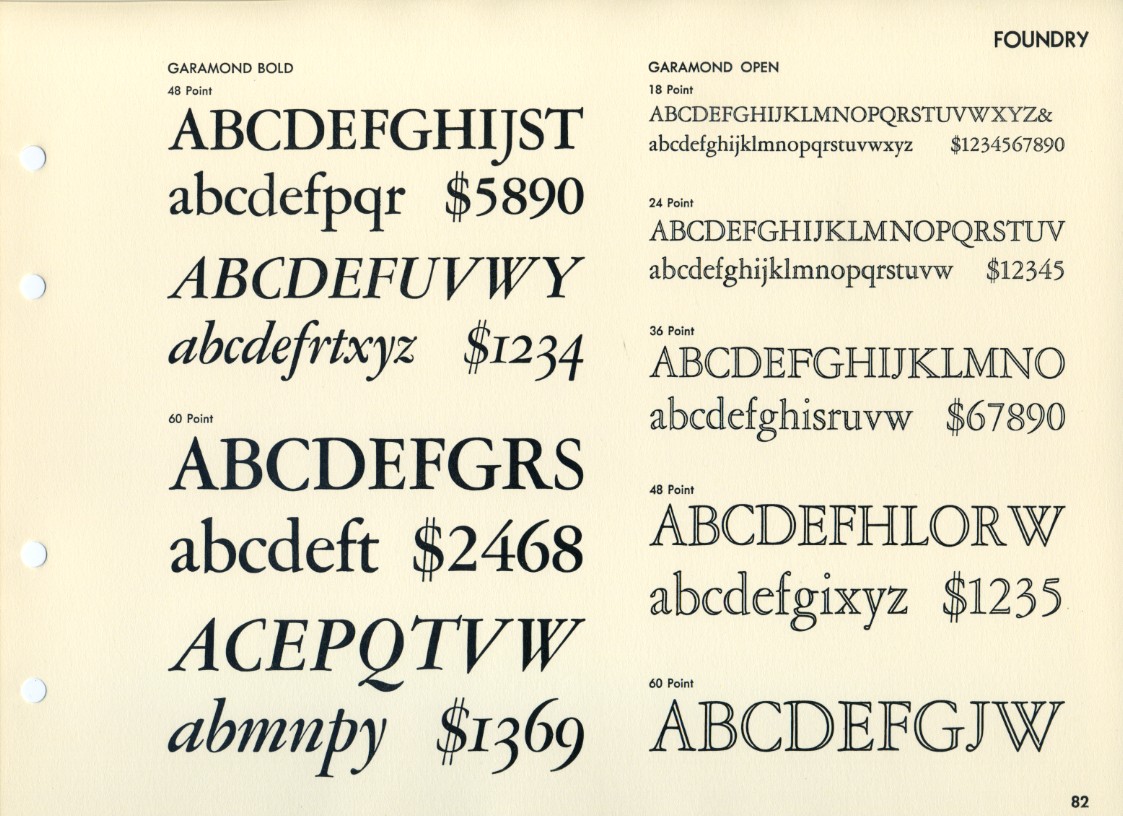
The name is a minefield. As covered above, “Garamond” describes a genre, and the versions disagree about weight, width and even basic letterforms. ATF’s revival is comparatively heavy and (in its italic) opinionated; Monotype’s is robust for text; Stempel’s is closer to Jannon; Adobe Garamond leans on Garamont’s authentic punches; ITC Garamond, popular in the 1970s, stretches the lowercase so aggressively that purists winced. Two books set in “Garamond” can look like different typefaces.
It does not want to be loud. Garamond has little display vocabulary in most revivals — no heavy poster weights, no condensed cuts. Ask it to shout in a headline and it sounds like a librarian raising their voice: technically possible, slightly wrong.
Practical Tips for Using Garamond
1. Start with the free one. EB Garamond, hosted on Google Fonts, is a scholarly revival based on Garamont’s authentic Egenolff–Berner specimens. It is comprehensive (including Greek and Cyrillic), variable, and genuinely excellent — the default choice for most projects.
2. For print books, consider Monotype or Adobe. Monotype Garamond’s sturdier color survives long print runs; Adobe Garamond Pro offers a complete professional package with small caps, old-style figures by default and thoughtful OpenType features.
3. Size it up. On screens, set Garamond two to three points (or several pixels) larger than you would set Helvetica or Inter.
4. Use the numerals deliberately. Old-style figures are gorgeous in prose and wrong in spreadsheets and prices; switch to lining figures where the context is data.
5. Pair with a quiet sans. For labels and interface elements, a neutral geometric or grotesque sans (or a slightly warm one like Source Sans) complements Garamond without competing with its italics.
The Alternatives
- Sabon (Jan Tschichold, 1964) — the minimalist’s Garamond: a strict, unified design named for Garamont’s son-in-law, famous for being the first face released identically for hand, machine and photocomposition.
- Caslon — the English old-style answer: slightly larger, sturdier, with more color variation; historically the other great “book face.”
- Bembo / Poliphilus — the Venetian branch of the same tradition, warmer and more archaic.
- Granjon — Garamont’s Parisian contemporary, revived in a lovely, slightly sturdier form.
- Jannon (the real thing, sort of) — revived directly as “Jannon” in modern digitizations, closing the circle of the historical mix-up.
Verdict
Garamond is typography’s proof that a design can be simultaneously five hundred years old and fully contemporary. Its letterforms encode the logic of the hand and the priorities of the Renaissance book, and every generation of revivals has found new work for them — from 1920s type foundries to Apple’s 1984 launch materials to today’s free variable fonts. Its weaknesses are specific and avoidable: size it generously, choose your revival knowingly, and keep it away from spreadsheets.
For long-form text — novels, essays, poetry, anything that rewards patience — Garamond remains the measure all other text faces are judged by. It is not neutral, like Helvetica; it is courteous. That is a rarer quality, and it ages better.
Rating: 9/10 — the classic book serif, still unmatched for quiet, humane reading; just verify which Garamond you mean.