Almost one hundred years after it was drawn, Futura still looks like a message from another era — an era that believed the future would be clean, rational and beautifully simple. It is on Supreme’s red box logo, in every Wes Anderson film title, on Volkswagen ads of the 1960s and, reportedly, on the plaque the Apollo 11 crew left on the Moon. Few typefaces can claim to have defined the visual language of an entire century. In this review, we look at how Futura came to be, why it looked so shockingly modern in 1927, where it still works today, and what you should know before using it in a digital project.
Origins: A Type Designer Who Wasn’t a Type Designer
Futura was created by Paul Renner, a German typographer, author and design theorist — notably, not a professional letter-cutting craftsman. In the mid-1920s, Renner was teaching in Munich amid the ferment of the Bauhaus movement, which preached that design should abandon ornament and embrace the pure forms of the machine age. Renner asked a radical question: what would letterforms look like if they were built from scratch on geometric principles — circles, triangles and straight lines — rather than inherited from centuries of handwriting and Renaissance calligraphy?
His answer was published as drawings in 1927 and cut into metal by the Bauer Type Foundry in Frankfurt. The result caused an uproar in typographic circles precisely because it broke every rule the craft held sacred. Traditionalists saw an assault on readability and heritage. The modernists saw the first letterform of a new civilization. Both were partly right, which is exactly why the design matters.
Even the naming was forward-looking: “Futura” — the future, in Latin and Italian — promised the world that typography, like architecture and industry, was about to be rebuilt. A promotional slogan of the era described the search for “the typeface of our time,” and Futura became the closest thing typography had to a manifesto you could set at 12 point.
The Design: Geometry With Consequences
Pure geometry, then compromise
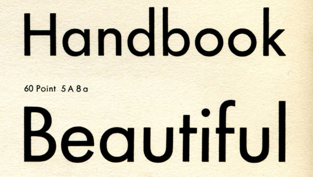
Futura’s lowercase is its calling card. The o is a near-perfect circle, the e almost a circle with a horizontal bar, the a a simple circle with a stem (the “single-story” a of a schoolroom primer). Stroke weight is close to monolinear, and sharp triangular tapers on letters like m and n — a concession to optical balance Renner himself argued over with the foundry’s punchcutters — keep the geometry from feeling dead. These pointed junctions are one of Futura’s most distinctive and loved details: geometry softened just enough to feel alive.
The unusual proportions
Here is the detail that separates Futura from nearly every modern geometric sans: its very small x-height. Lowercase letters are tiny in proportion to capitals, with dramatically long ascenders and descenders. Set a line of Futura next to Inter or Helvetica and the difference is instantly visible — Futura’s caps tower over its lowercase like a tall man walking a small dog.
This proportion is why Futura at display sizes looks effortlessly elegant, all legs and air, and why it becomes genuinely difficult to read below about 14 points. Small text needs a big x-height; Futura deliberately rejects it. It is a typeface that would rather be beautiful at 48 points than practical at 10 — a trade almost no contemporary UI typeface would dare make.
One look, many voices
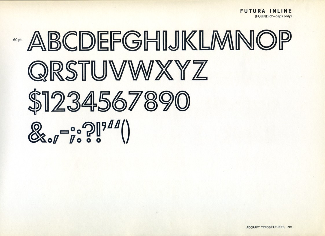
The original family was comparatively restrained, but over the following decades Bauer expanded it into a long-running system: Light, Book, Medium, Bold, Heavy, plus condensed, extended and decorative display cuts. Futura Display, with its exaggerated geometry, and Futura Inline, with its double-struck outlines, showed that the underlying idea could be dressed up as well as stripped down.
Futura in the Wild
The 20th century adopted Futura as its unofficial voice. The famous 1960s Volkswagen “Think Small” and “Lemon” advertisements — often called the best advertising campaign ever run — were set in Futura. Absolut Vodka built four decades of print advertising on it. IKEA used it as its corporate typeface until 2010. Calvin Klein, Supreme, Nike’s classic campaigns, Louis Vuitton’s modern-era monogram era branding, Wes Anderson’s title sequences from The Royal Tenenbaums onward — the list barely ends.
The typeface’s association with modernity was so strong that it even entered politics and space. Futura’s clean geometry fitted the aesthetic of both the German avant-garde (and, complicatedly, drew attacks from the Nazi cultural establishment — Renner himself was briefly arrested in 1933 for opposing the regime) and, decades later, NASA-era futurism, when the commemorative plaque left on the lunar surface in 1969 carried its capitals into history.
What explains this reach? Futura is one of very few typefaces that can look simultaneously premium and democratic. Its geometry reads as intelligent, honest and forward-looking; its simplicity survives photocopying, silkscreening, signage and television. That combination made it the default ambition of branding for half a century.
The Weak Spots
Small sizes are not its territory. As covered above, the tiny x-height limits body-text duty. Long paragraphs in Futura feel airless and tiring; even its defenders use it mainly for headlines, packaging and logos.
The digital landscape is a minefield. The original foundry’s version was drawn for metal, and countless unauthorized or half-hearted digitalizations circulate — some with the pointed joins sanded off, others with spacing that collapses at display sizes. For years, “Futura” in a font menu could mean anything. The situation is better now, but you still need to choose your version carefully.
It has been copied to death. Century Gothic, Avenir, Avant Garde Gothic, Jost and dozens of free geometric sans-serifs all descend from or compete with Futura’s idea. That ubiquity blunts its edge: in a startup pitch deck, geometric sans is the wallpaper of the era, not a statement.
Personality is severe, not warm. Futura’s circles are colder than Avenir’s humanist warmth or Circular’s friendliness. For hospitality, food or community brands, that severity can read as aloof.
Practical Tips for Using Futura
1. Use a high-quality revival. Futura ND by Neufville Digital was produced with a documented connection to Renner’s own notes; URW’s and Bauer’s official versions are solid too. Avoid no-name knockoffs with rounded joins.
2. Keep it large. Treat Futura as a display face: headlines, titles, packaging, logotypes. Pair it with a hardworking text face for body copy — a humanist serif or a generous x-height sans will do.
3. Watch the spacing at small sizes. Metal Futura was spaced optically; some digital cuts inherit awkward gaps between pointy letters. Kern m, n, v and w junctions if your layout is sensitive.
4. On a budget, try Jost. This free Google Fonts family is an open-source interpretation of Renner’s geometric ideal — not a clone, but honest about its inspiration and usable for real projects.
5. Lean into caps for drama. Futura’s capitals are the most famous part of the design. All-caps settings with wide letterspacing are where it is at its most iconic — just check your tracking, because geometry punishes sloppy spacing more than calligraphic faces do.
The Alternatives
- Avenir (Frutiger, 1988) — the humanist’s answer to Futura: same geometric skeleton, gentler proportions, far better at text sizes. The first choice if you love the look but need readability.
- Century Gothic (1930s/1990s) — wider, rounder, very popular in American schools; a useful cheap stand-in with a friendlier feel.
- Jost (free) — the best open-source route to the Futura idea, straight from Google Fonts.
- Avant Garde Gothic — the 1960s American reinterpretation, more display-oriented and tighter.
- Renner\* and Spartan — further open-source experiments in the same lineage.
Verdict
Futura is that rare thing: a typeface that changed what people believed type could be, and then stayed relevant long enough to become a classic of two different centuries. Its geometry is uncompromising, its history is dramatic, and its best digital revivals are genuinely excellent. Its weaknesses — the tiny x-height, the crowded field of imitators — are real but easy to plan around.
If you need warmth and readability in running text, look elsewhere. But for a headline, a logo or a title card that should feel confident, rational and quietly futuristic, Futura remains nearly unbeatable a century on. The future it promised never quite arrived — but it still looks good written in Futura.
Rating: 9/10 — a century-defining classic; just keep it away from your body text.