If a single typeface could be photographed holding a passport, Helvetica would have the most stamps of any font alive. It is on the New York City subway, on Lufthansa jets, on government forms, on the logos of dozens of the world’s largest companies, and in the permanent collection of MoMA. It is also — this is the strange part — a typeface many people cannot name on sight, because Helvetica’s defining ambition is to be invisible. Designed in Switzerland in 1957 as a tool, not an artwork, it became the most used, most copied, most parodied and most debated sans-serif of the twentieth century. This review looks at where it came from, why designers either love it or are bored to tears by it, and what you should know before using it today.
Origins: A Sales Director’s Brief
Helvetica was born at the Haas Type Foundry in Münchenstein, a small Swiss town near Basel. In 1956, the foundry’s managing director Eduard Hoffmann made a pragmatic decision: the booming Swiss advertising market was buying modern sans-serifs, and Haas — whose parent relationship gave it ties to the classic nineteenth-century grotesque Akzidenz-Grotesk — wanted a clean, modern competitor of its own. He handed the task to Max Miedinger, a seasoned typeface designer and sales representative at the foundry.
Miedinger redrew the old grotesque with cleaner, more even forms and a larger x-height. The result was released in 1957 under the sober name Neue Haas Grotesk — and it sold well. But the face became a phenomenon only after 1960, when the German parent foundry D. Stempel AG renamed it “Helvetica,” Latin for “the Swiss,” to market it internationally. The rebranding was a masterstroke: a neutral name for a neutral face, implying not a personality but a standard, like stainless steel or the metric system.
Switzerland in the 1950s was the epicenter of the “Swiss Style” of graphic design — a movement that preached objectivity, grids, asymmetry and the removal of the designer’s ego. Helvetica was that philosophy cast in metal. It did not illustrate; it informed.
The Design: Engineered Neutrality
What “neutral” actually means
Helvetica’s neutrality is not an absence of decisions; it is a dense set of them. The apertures — the openings of letters like c, e, s and a — are deliberately closed, giving each glyph a self-contained, rectangular solidity. The terminals of curves are cut strictly horizontally or vertically, so the letterforms align with an invisible grid. The strokes are near-monolinear, the spacing is tight and even, and the x-height is generous without being extreme. Nothing points, nothing swells, nothing performs.
The result is a typeface that imposes almost no mood of its own — which is exactly why it could carry any mood a client wanted. A bank could look trustworthy, an airline could look modern, a government could look authoritative, all in the same letterforms.
The family grew into a system
The original family expanded steadily: Light, Medium, Bold, Black, plus condensed and extended companions, and eventually a Neue Helvetica reworking with a unified weight system, and Helvetica Now, a modern reinterpretation with optical sizes for text, display and micro settings. The breadth of the family is one of Helvetica’s genuine superpowers — it is less a typeface than an infrastructure.
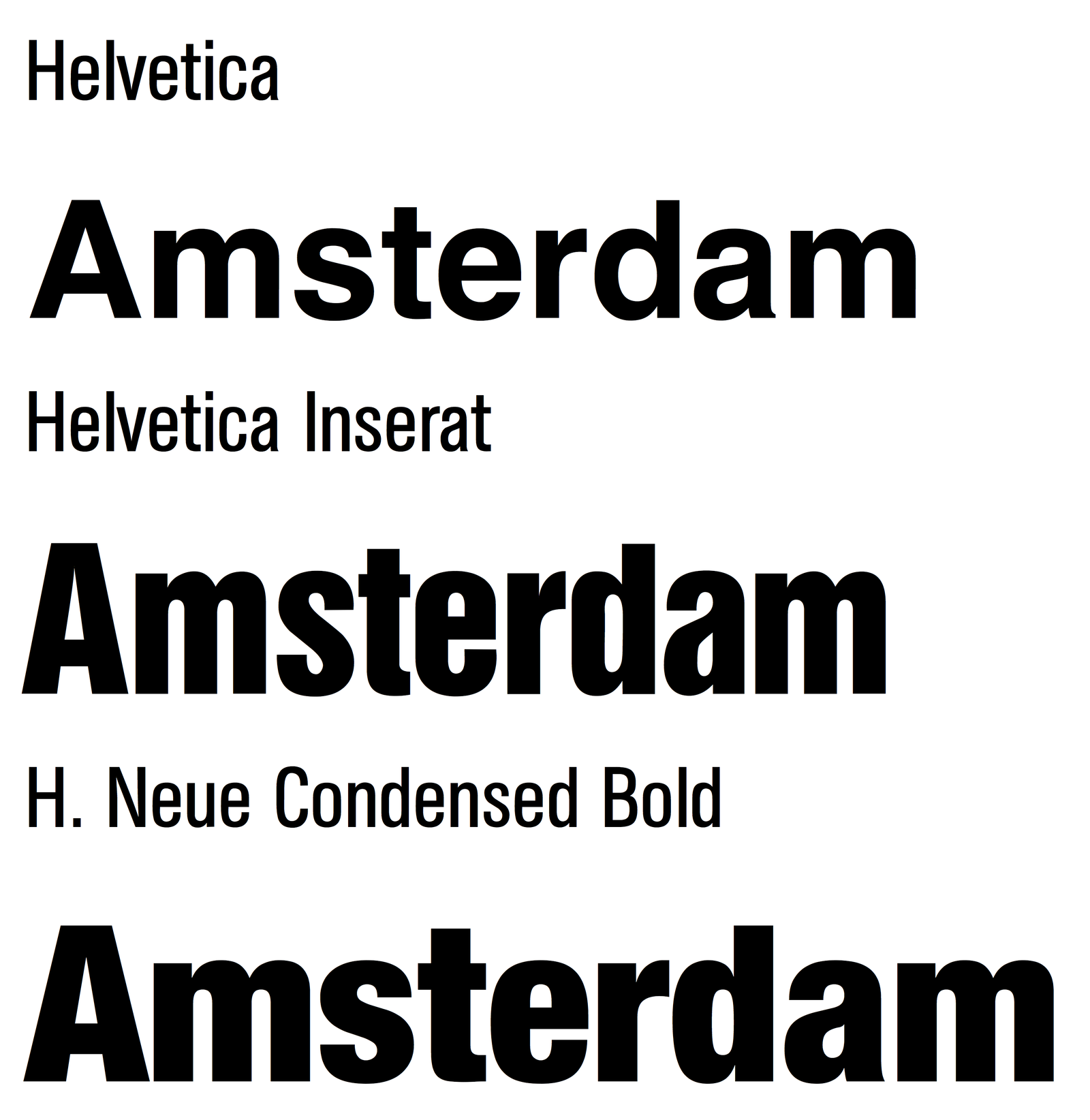
Helvetica in the Wild
The 1960s and 1970s made Helvetica the visual voice of corporate modernity. American Airlines, Lufthansa, Nestlé, BMW, Toshiba, American Apparel, Crate & Barrel, The North Face, Tupperware — a staggering share of postwar brand identities were set in it. The New York City subway’s signage system, directed by designers Massimo Vignelli and Bob Noorda, brought Helvetica (after early use of a related face) into the daily lives of millions of commuters. NASA’s technical documentation and Space Shuttle interfaces leaned on it; when you picture “official document,” there is a good chance your brain is rendering it in Helvetica.
Its cultural footprint grew beyond design. In 2007, Gary Hustwit’s documentary Helvetica turned a font into a cinema subject, and “Helvetica cola” satires and counterculture parodies followed — the typeface had become a symbol of Establishment neutrality, loved and resented in equal measure.
Yet the deepest reason for its dominance is boring and practical: Helvetica simply works everywhere. It sets dense text without fuzz, survives photocopying, engraving, embroidery, screen printing and low-resolution signage, and it licenses across every platform. Like concrete and corrugated steel, it is a material before it is a style.
The Weak Spots
Ubiquity became its burden. A typeface designed to carry no personality ends up broadcasting one anyway: the personality of the corporation. By the 1980s a creative backlash was inevitable, and it has never fully subsided. Choosing Helvetica today is a statement — just not the one it used to be.
Small-size reading is a known weakness. The closed apertures that give Helvetica its solidity cause neighboring letters to visually interfere at text sizes; critics have long noted that words like “clean” or “roar” can mush together. Typeface designers studying letter recognition have shown that more open apertures read more quickly. Helvetica was tuned for display and signage first, reading comfort second.
Version confusion is real. “Helvetica” on your computer might be the 1957 metal design, the 1983 Neue Helvetica, the 2014 Neue Haas Grotesk revival, or — on many Windows machines — nothing at all, with Arial silently substituting. Licensing a proper version costs real money, and the differences are not cosmetic: the spacing and stroke tuning vary considerably.
It has no italic in the true sense. Helvetica’s “italic” is an oblique — the roman slanted, with calligraphic qualities absent. For editorial or expressive work, that is a real limitation.

Practical Tips for Using Helvetica
1. Buy the right one. If the project justifies Helvetica, it justifies Neue Haas Grotesk (the faithful 2010s revival by Christian Schwartz, available via Adobe Fonts) or Helvetica Now for modern UI work. The old bundled Neue Helvetica versions have inconsistent spacing by today’s standards.
2. On a budget, use a free clone. TeX Gyre Heros, Nimbus Sans and Arimo are legal, metric-similar free alternatives. None is a scandal; each is a pragmatic stand-in.
3. Tighten your tracking for display. Helvetica benefits from slightly negative letterspacing at large sizes; leave it loose and headlines feel 1980s-corporate rather than crisp.
4. Avoid tiny sizes for long reading. For UI body text at 12–14px, more open faces (Inter, Roboto, SF Pro) measurably outperform it.
5. Pair it with texture. Against Helvetica’s neutrality, a characterful serif or an expressive display face creates productive tension; pairing it with another neutral sans produces the beige-on-beige effect.
The Alternatives
- Univers (Adrian Frutiger, 1957) — Helvetica’s great contemporary rival, released the same year. More rigorously systematized (the numbering system!) and generally considered the finer work of design. Frutiger’s later faces fixed the small-size problems entirely.
- Arial — born as a metrically compatible substitute; after decades of sibling rivalry, most typographers still give the nod to Helvetica’s spacing and R, G and a.
- Neue Haas Unica — a thoughtful 2014 synthesis of Helvetica and Univers.
- Inter / Roboto / SF Pro — the screen-native descendants that solved Helvetica’s small-size problems for interfaces.
- Aktiv Grotesk, Acumin — modern corporate grotesques for those who want the flavor without the baggage.
Verdict
Judging Helvetica as a design is almost beside the point; it is less a typeface than a piece of twentieth-century infrastructure, the typographic equivalent of the shipping container — standardized, neutral, everywhere, and quietly revolutionary for exactly those reasons. Its flaws (tight apertures at text sizes, version chaos, creative overexposure) are real, but every one of them has a well-documented workaround, starting with the excellent Neue Haas Grotesk revival.
Use it when you want authority without argument and style without era. Just know that in 2026, choosing Helvetica is no longer neutral — it is a retrospective.
Rating: 9/10 — the most consequential typeface of the corporate age; read the fine print about which version you are actually buying.