In the 1750s, an English industrialist named John Baskerville decided that English printing was sloppy, and set out to fix it with an obsession that bordered on madness. He invented new papers, new inks, new presses and, along the way, one of the most beautiful and influential typefaces in history. Printers of his era hated it; the famous rival type designer William Caslon reportedly refused even to look at it. A century later, typographers hailed it as a masterpiece. Today Baskerville sits in the sweet spot between the warmth of the Renaissance and the precision of the modern age — a face you have read thousands of times without ever catching it at work. This review covers its improbable origin story, its radical design, its digital afterlife, and how to use it well today.
Origins: A Writing Master With No Training in Type
The story of Baskerville begins with an unlikely hero. John Baskerville (1706–1775) was not a printer by trade but a master calligrapher and successful japanning manufacturer — a maker of lacquered ware in Birmingham — who had grown wealthy enough to pursue perfection as a hobby. When he turned to printing in the early 1750s, he did so with the eye of an outsider and the budget of an industrialist, and he rejected nearly everything the English print trade took for granted.
His type was cut for him by John Handy, but to Baskerville’s own drawings and under his ruthless supervision. His paper was smoother and brighter than any made before, because he refined it himself. His ink was famously black because he ground and boiled it himself. His presses used heated metal platens to flatten the page evenly. He built, in effect, a complete printing system around the typeface, because he understood — decades before this became industry wisdom — that a letterform can only look as good as the paper, ink and pressure that carry it.
The establishment’s reaction was hostile. English printers were loyal to William Caslon’s sturdy Old English faces, and Baskerville’s elegant, spare letters looked, to them, like an insult to tradition. Benjamin Franklin, a friend and admirer, told the story of a skeptic who dismissed the type as fit only for fine ladies; Franklin then showed him a piece of common printed matter that the man praised in ordinary terms — it was Baskerville’s type all along, revealed only when Franklin produced the proof.
The Design: The Bridge Between Two Worlds
What “transitional” means
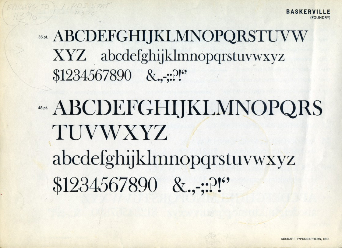
Typographers classify serifs into periods, and Baskerville is the textbook transitional face: it stands exactly halfway between the old-style serifs of the Renaissance (Garamond, Caslon) and the modern faces of the industrial age (Bodoni, Didot). You can see the transition in every part of the letter:
- More contrast, still controlled. Thick and thin strokes differ more sharply than in Garamond, but without the hairline extremes of Bodoni.
- Vertical stress. The axis of the letterforms has straightened from the pen-driven slant of the old style toward the engineered verticality of the moderns.
- Finer, flatter serifs. Delicate and horizontal, pointing toward the austerity of Didone faces while retaining a bracketed softness.
- Increased letter-spacing. Baskerville airily separates its letters — a deliberate, luxurious looseness that gave pages their celebrated sparkle on his brilliant white paper.
The famous lowercase
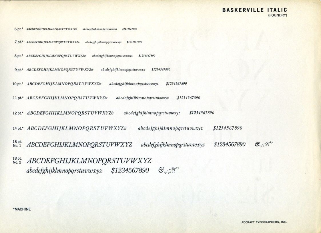
Baskerville’s lowercase g is one of typography’s showpieces — an elegant double-story form with a delicate lower loop. Its a, e and c are generous and round, the italic is genuinely written rather than slanted roman, and the overall texture is bright, open and civilized. In the 2000s, an experiment by the writer Errol Morris suggested something remarkable: people presented with a statement in Baskerville were measurably more likely to believe it than when the same text was set in other fonts. Whatever one thinks of the methodology, the anecdote captures the face’s reputation: Baskerville sounds trustworthy.
Decorations and the complete book
Baskerville’s editions of Virgil, Milton and the Bible were as important as the type itself. His classically inspired ornaments and generous margins became a model for fine printing across Europe, directly influencing the Didots in France and Bodoni in Italy — the names that would complete the typographic revolution he started.
Baskerville in the Wild
After John Baskerville’s death, his punches passed through several hands (his widow sold them to the French playwright and publisher Beaumarchais, of all people, for his Voltaire edition) before landing with Cambridge University Press, which still uses Baskerville faces today. The type was largely eclipsed during the Didone craze of the nineteenth century, revived by the private-press movement around 1900, and became a fixture of twentieth-century book design.
Modern readers have met it everywhere without necessarily knowing: the Harvard Business Review, Canada’s federal identity program (the face of Canadian government communications for decades), countless literary imprints, and Penguin Classics covers that keep it in circulation among design-conscious audiences. As a brand voice, Baskerville reads as educated, calm and slightly old-money — which is precisely why banks, publishers, law firms and luxury goods keep returning to it.
The Weak Spots
It is delicate. Baskerville’s fine serifs and moderate contrast were designed for smooth paper and gentle presswork. On cheap paper, photocopiers or low-resolution screens, the delicate strokes drop out and the face can look thin and fussy. Its revival history is a long argument about how much weight to add back.
It is not neutral. Unlike Helvetica, Baskerville always speaks with an accent: eighteenth-century elegance. For technical, utilitarian or playful projects, that accent is wrong.
Digital versions vary widely. The most bundled versions (such as the Monotype Baskerville long standard on macOS) are x-height-boosted adaptations rather than faithful revivals. Typophiles point readers toward more considered interpretations for serious work.
Display sizes need care. At very large sizes, its details reward good spacing; at small sizes it needs a sturdier cut. It is a text face first, but not a face that survives every circumstance unedited.
Practical Tips for Using Baskerville
1. Choose your revival deliberately. Libre Baskerville (free on Google Fonts) is a screen-oriented interpretation with a large x-height — excellent for web reading, though heavier than the original. ITC New Baskerville offers a complete professional family. For authentic color, the URW and Monotype classics have their defenders.
2. Size up on screens. As with Garamond, Baskerville’s historical x-height runs small; bump web sizes a notch or lose your readers.
3. Give it whitespace. The face was born on bright paper with airy margins. Dense, cluttered layouts strangle it; generous leading and margins let it sparkle.
4. Use it where trust matters. Finance, academia, law, publishing, heritage brands — Baskerville’s credibility dividend is real.
5. Pair with restraint. A neutral geometric sans (Futura, Inter) or a quiet slab provides contrast without stealing the stage. Avoid pairing it with other historical serifs of the same period — the conversation gets muddy.
The Alternatives
- Libre Baskerville — the free, web-optimized revival; slightly wide and sturdy, ideal for blogs and long-form reading.
- Mrs Eaves — Zuzana Licko’s 1996 riff on Baskerville (loose spacing, small x-height, swashes); a bestseller with a personality all its own, loved in editorial design.
- Caslon — the tradition Baskerville provoked; sturdier, more hand-made, still the workhorse of book publishing.
- Bulmer — a contemporary English refinement of the same transitional moment, overlooked and useful.
- Libre Caslon Text, Playfair Display — further free routes into the same historical territory, each with a different temperament.
Verdict
Baskerville occupies the exact center of classical typography — warm where the moderns are cold, precise where the old styles are rustic. Its history is one of the best stories in the field: a wealthy amateur with an obsession, hated by his peers, whose “mistakes” became the foundation of the next two centuries of type design. Its weaknesses — delicacy, an unmistakable period accent, uneven digital versions — are the price of that distinct character.
Use it when you want a text face with manners: literary, credible, quietly luxurious. Between Garamond’s humanity and Bodoni’s geometry, Baskerville is the diplomat — and, two hundred and fifty years on, still one of the most persuasive voices in type.
Rating: 9/10 — the perfect middle of the serif tradition; handle its delicacy with the care its inventor demanded of everything.