At the end of the eighteenth century, as Europe rebuilt itself in marble and mathematics, typography went through the same transformation. The rounded, handwritten warmth of the Renaissance gave way to something colder, sharper and thrillingly modern. Its name was Bodoni. For over two hundred years this face has been the signature of luxury fashion, avant-garde poetry and editorial drama — the typeface of Vogue, of Playbill, of countless minimalist posters. It is also, famously, one of the most misused typefaces in the world. This review traces the life of Giambattista Bodoni, dissects the design that made type look like architecture, and explains how to handle a face that punishes carelessness more than almost any other.
Origins: The Printer Who Outlived Every Fashion
Giambattista Bodoni (1740–1813) was born in Saluzzo, in the Piedmont region of Italy, the son of a printer, and died as the most celebrated printer in Europe. His career traced the Enlightenment itself: after an early stint at the Congregation for the Propagation of the Faith in Rome — where he cut type and argued with his superiors — he took charge of the ducal press in Parma in 1768, under Duke Ferdinand of Bourbon-Parma.
Parma gave Bodoni what few printers ever had: money, time and the freedom to pursue perfection for its own sake. Over four decades he printed lavishly illustrated editions of the classics in Greek, Latin, Hebrew, Russian, Arabic and dozens of other scripts, and his fame grew until he was receiving orders from royalty and the newly arrived Napoleon, who granted him a pension. When his masterwork, the Manuale Tipografico — a two-volume specimen of his types — appeared after his death, it was greeted as a monument.
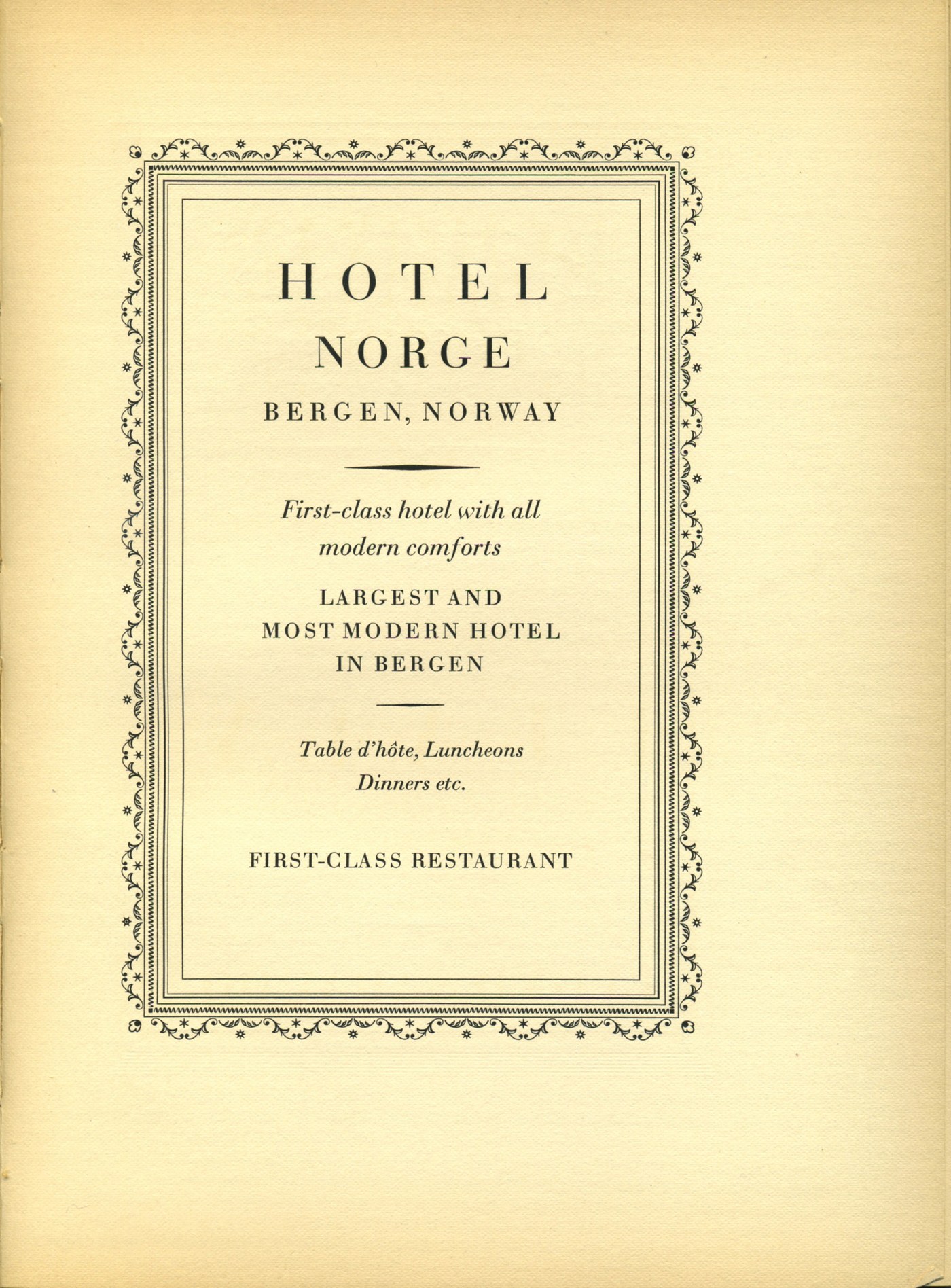
What Bodoni did to letterforms was genuinely revolutionary. Working in parallel with the French Didot family (and influenced by Baskerville’s earlier experiments), he abandoned the last pretense that type should imitate the broad-nib pen. Instead he built letters from geometry: hairline strokes, ball terminals, perfectly vertical stress. Type stopped looking like writing and started looking like engineering — a face for the age of the machine, decades before the machines arrived.
The Design: Extreme Contrast as a System
Hairlines, ball terminals, verticality
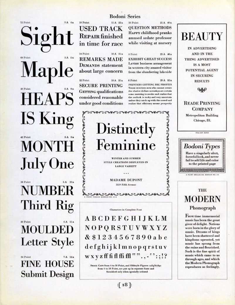
Bodoni is the leading member of the Didone class, and its defining trait is contrast taken to its logical extreme. Thick strokes are nearly slab-like; thin strokes are hairlines almost fine enough to sever. The stress of each letter is strictly vertical, the serifs are thin, flat and unbracketed — attached like crossbeams rather than grown like calligraphy — and curves end in expressive ball terminals. The lowercase a, the c and the g are the standard teaching examples: circles and columns rather than gestures.
The effect at large sizes is breathtaking. Bodoni headlines have a tension no other classic face achieves: elegant and severe at once, decorative and austere. This is why fashion houses adopted it almost reflexively — the typeface draws a straight line between modern engineering and aristocratic taste.
The price of hairlines
The same hairlines that make Bodoni’s display sizes dazzling destroy it in the wrong conditions. Fine strokes need perfect printing: smooth paper, crisp impression, clean reproduction. On cheap paper or a low-resolution screen, hairlines break up or vanish, and the text dissolves into fragments. Bodoni was never, in its pure form, intended for long body text — it is a display and short-text face by physics as much as by intent. (This did not stop nineteenth-century printers from setting entire books in it, and suffering for it.)
Bodoni in the Wild
Fashion discovered Bodoni early and never let go. Vogue’s iconic masthead has carried variants of Bodoni since the magazine’s modernization in the early twentieth century; Harper’s Bazaar followed the same route. Giorgio Armani, Valentino, Dolce & Gabbana and dozens of luxury brands have used it or its descendants. Broadway’s Playbill has printed its name in Bodoni-derivative lettering since the 1880s — possibly the longest continuous engagement of a typeface in show business.
Bodoni also has a serious avant-garde résumé. In the 1920s, writers and designers of the European avant-garde loved its stark geometry, and it appears throughout classic Futurist and modernist typographic experiments — the face was modern before modernism existed.
Like Garamond, “Bodoni” is less one design than a jurisdiction of them. The principal branches: Bodoni’s own press types (preserved in Parma); the Bauer Bodoni, cut in Germany and prized as the most faithful to Bodoni’s later ideas; Linotype and Monotype Bodoni, the Anglo-American workhorses; and the modern Bodoni Old Face and ITC Bodoni Seventytwo, which consciously recreate different stages of his career. Modern revivals such as Bodoni Moda (free on Google Fonts) have brought the face back to digital screens with optical sizes that finally solve its hairline problem.
The Weak Spots
The screen was not kind. For decades, Bodoni on the web meant broken hairlines. Only with high-density displays and careful optical-size design (Bodoni Moda’s optical axis, or the masterfully engineered versions from foundries) has the face become truly usable online.
It is terrible for long reading. The extreme contrast fatigues the eye; paragraph-length settings in classic Bodoni belong in museums. Use it for headlines, titles, pull quotes and short display text.
It overpowers everything. Bodoni is a soloist. Set it next to another characterful face and the page turns into an argument. It demands quiet companions — or the courage to let it stand alone.
Its coldness limits warmth. Bodoni communicates elegance, authority and drama; it does not do cozy. Food packaging for handmade jam, community newsletters and children’s brands will read as either pretentious or accidental irony.
Practical Tips for Using Bodoni
1. Match size to contrast. Reserve hairline-heavy cuts for large sizes; for anything smaller than about 16px, use a text-optimized optical size (Bodoni Moda’s lower optical sizes are designed exactly for this).
2. Embrace the fashion instinct. Bodoni + restrained layout + generous whitespace equals instant editorial gravitas; Bodoni + clutter equals 1990s desktop publishing.
3. Pair it with a quiet sans or a warm serif. For body text under a Bodoni headline, a humanist serif (or an unobtrusive sans like Inter) keeps the drama in the display line where it belongs.
4. Watch the ball terminals in tight tracking. Bodoni’s round terminals collide when letters are squeezed; its elegance needs room to breathe.
5. For free, go Bodoni Moda. It is the best open-source Didone, with a proper optical-size axis — an unusual and valuable feature even among commercial fonts.
The Alternatives
- Didot — the French rival: even finer hairlines, a more aristocratic attitude, and the typeface of Parisian fashion; harder to use, even more rewarding at display sizes.
- Bodoni Moda — the accessible modern revival, free and optically sized.
- Playfair Display — a free transitional-didone hybrid with sturdier hairlines; the practical choice for screens that need the drama without the fragility.
- Bauer Bodoni — the connoisseur’s revival, prized for authenticity.
- Walbaum — the gentler German cousin of the Didone class, warmer and more readable.
Verdict
Bodoni is typography’s opera: extreme, engineered, incapable of blending into the background, and magnificent when staged well. It ended the handwritten era of type and opened the geometric one, and its hairlines still define the visual vocabulary of luxury. Its fragility is not a flaw but a discipline — it simply refuses to be used carelessly, which may be the most Bodoni-like quality of all.
For fashion, drama, cultural institutions and any design that wants to feel composed rather than written, Bodoni remains the sharpest tool in the drawer. Just never ask it to whisper for four hundred words at a time.
Rating: 9/10 — the most dramatic classic serif ever cut; treat it like a grand piano, not a keyboard.